
Using the editor
The editor is one React application served by the engine at /editor/. It talks only to the public APIs, so everything it does can also be scripted. Sign in with your identity provider, or with the dev token in development.
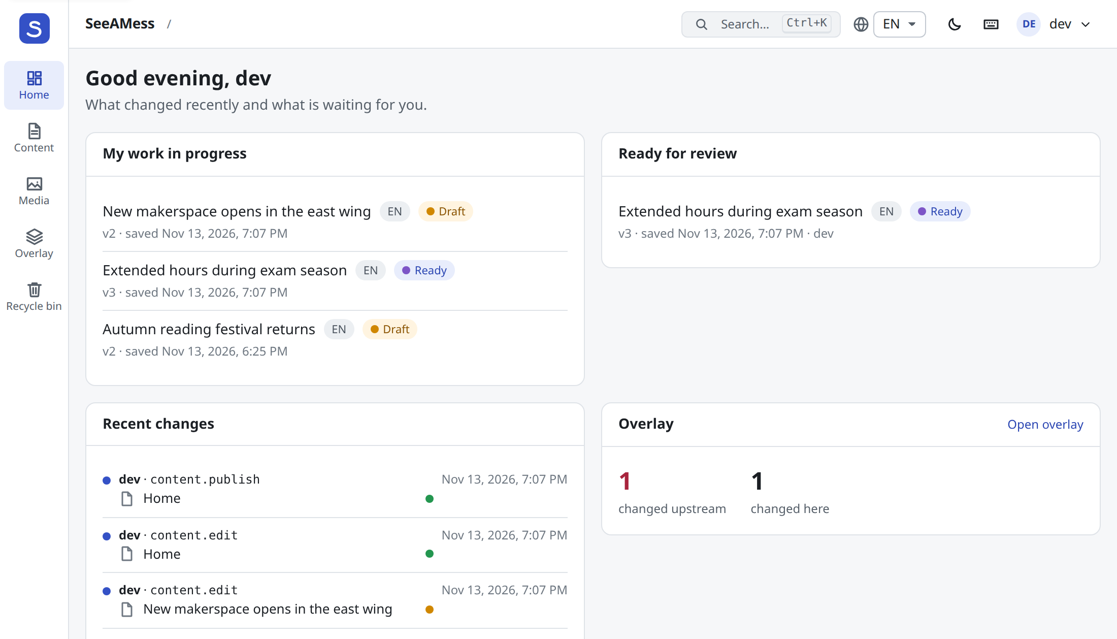
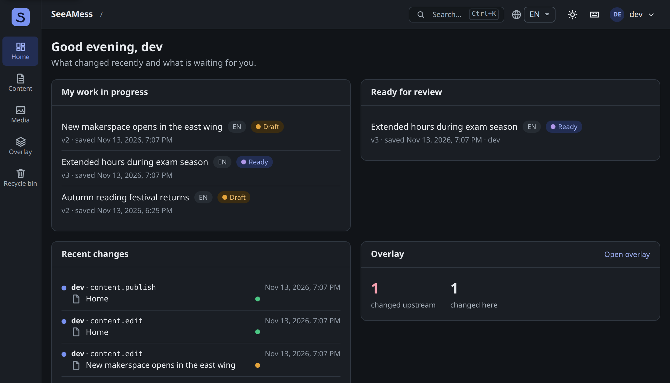
The dashboard shows your work in progress, what is ready for review, and recent changes from the audit log.
Content
Section titled “Content”The Content screen has the tree on the left and the open content on the right. Deep links work: /editor/content/<id>?locale=pl opens that content in Polish and expands its ancestors. The content language is the selector in the top bar; the UI language is in the user menu (English and Polish).
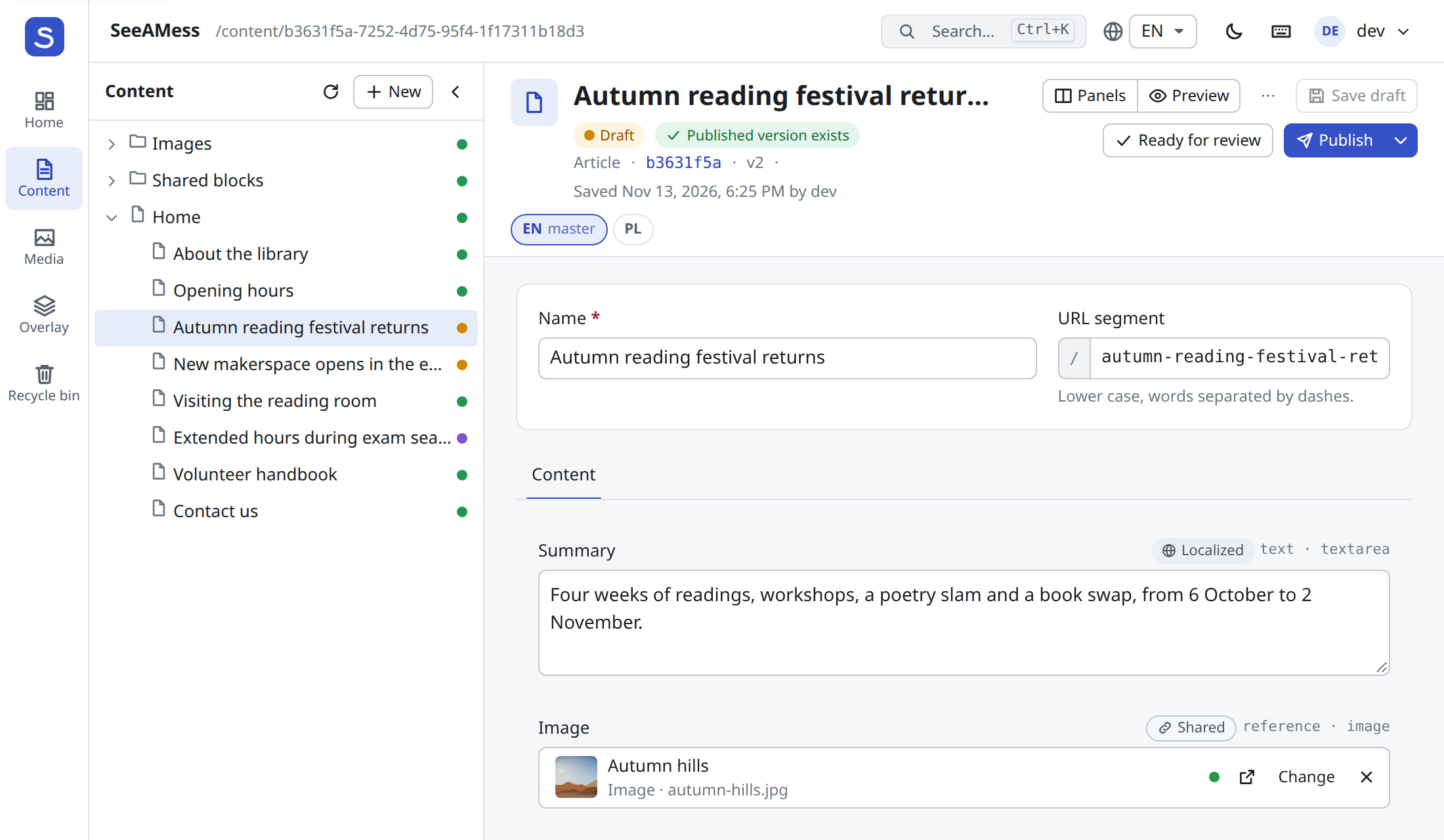
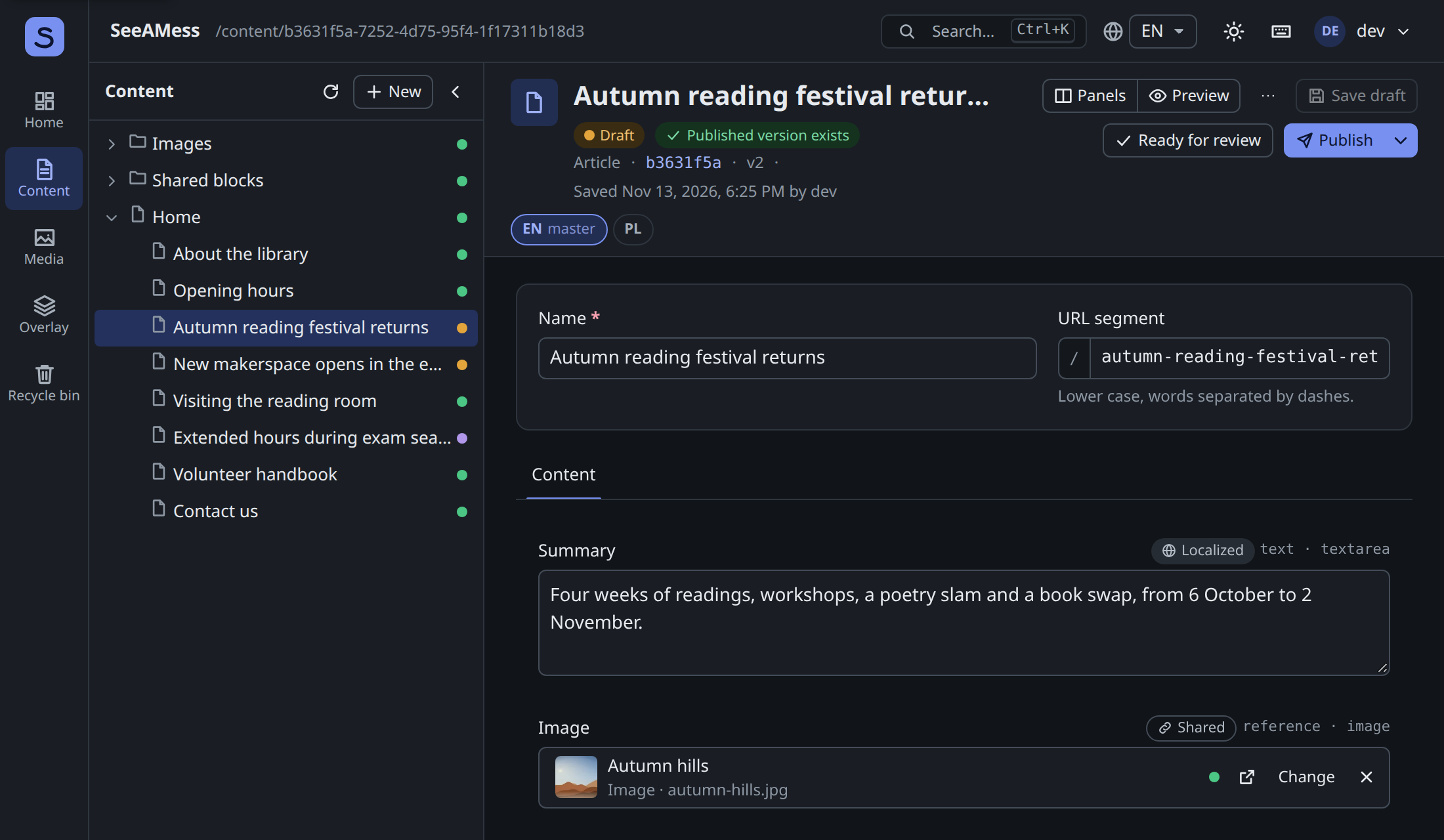
- Forms come from the schema. Groups become tabs, each field kind has its editor, and each field shows whether it is Localized or Shared. Shared fields are read-only on a non-master locale (“Show value” loads the master’s).
- Saving. Drafts autosave 2.5 s after the last change (toggle in the user menu). If someone else saved the same content meanwhile, a conflict dialog lets you compare or overwrite.
- Validation errors from save or publish appear on their fields, and the tab with the error is selected.
- Rich text is TipTap, with links to content, images from the media library and tables.
Versions, review and scheduling
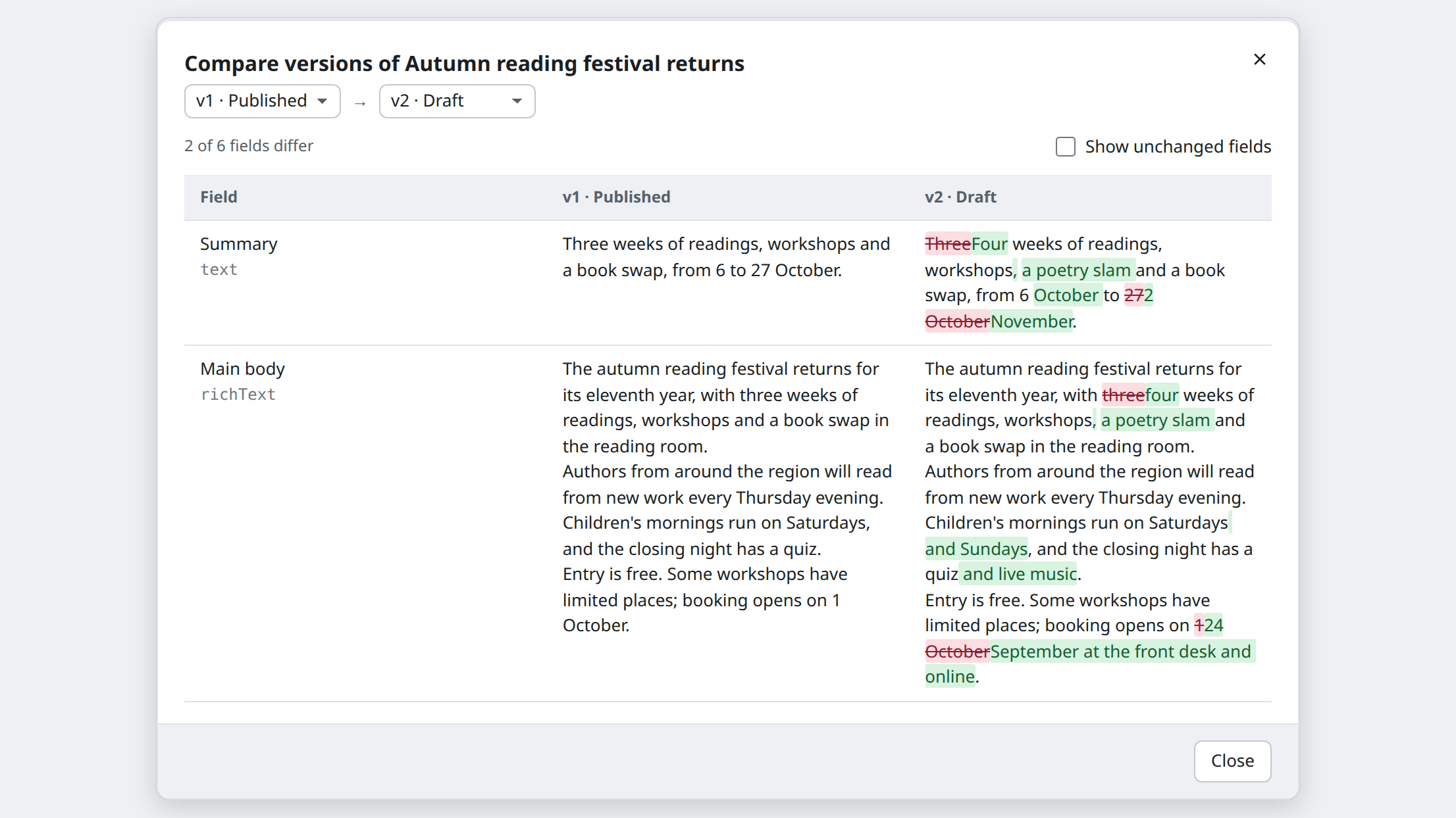
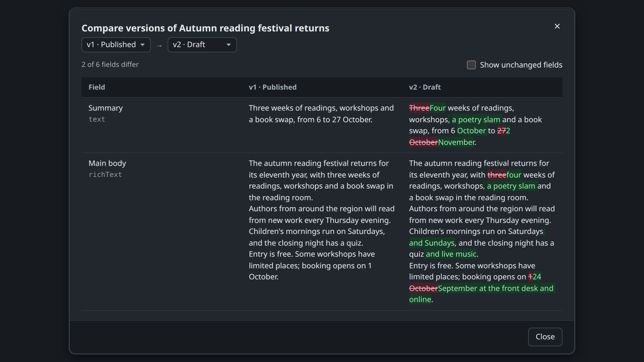
Section titled “Versions, review and scheduling”The Versions panel lists every version. Tick two and choose Compare for a field-by-field word diff; any version can become a new draft.
- Ready for review marks the version
ready; a reviewer publishes or rejects it with a comment that everyone who can read the content sees. - Schedule publishes at a future time; Unschedule and Unpublish are in the publish menu.
Preview
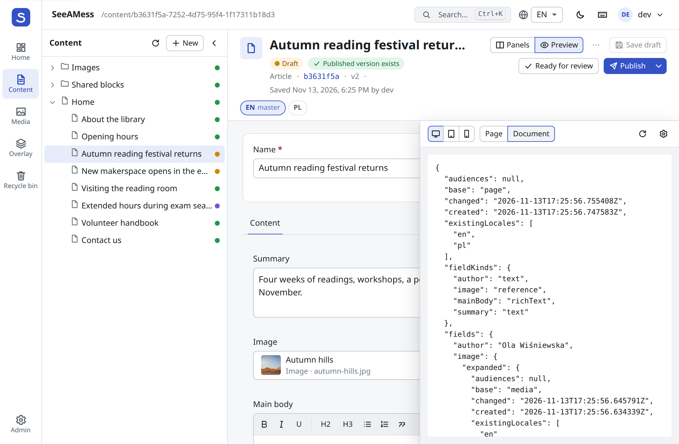
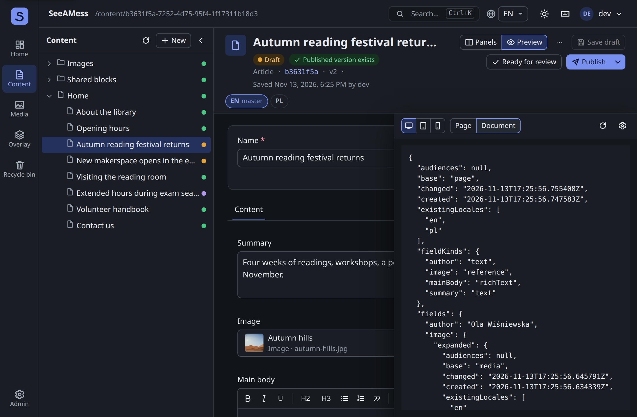
Section titled “Preview”Preview opens a signed link to the version in a pane, at desktop, tablet (768 px) or phone (375 px) width. When the version has no page URL, it shows the delivery document a front-end would render. A front-end can support click-to-edit by marking elements with data-sam-field and answering the editor’s postMessage channel; the editor checks every message’s origin and never posts to *.
Used by, access and the recycle bin
Section titled “Used by, access and the recycle bin”- Used by lists the content that refers to this one.
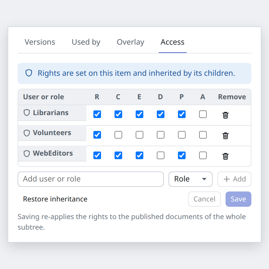
- Access edits the access list: rights for read, create, edit, delete, publish and administer per user or role, or restore inheritance. Saving re-applies the rights to the published documents of the whole subtree.
- Delete removes a whole subtree. The dialog says how many items go with it and who still points at it. The Recycle bin restores a subtree (optionally under another parent), and admins can purge it.
Search
Section titled “Search”Ctrl/Cmd+K or / opens quick search. The same search, filtered by allowed types, drives the reference, content area and image pickers.
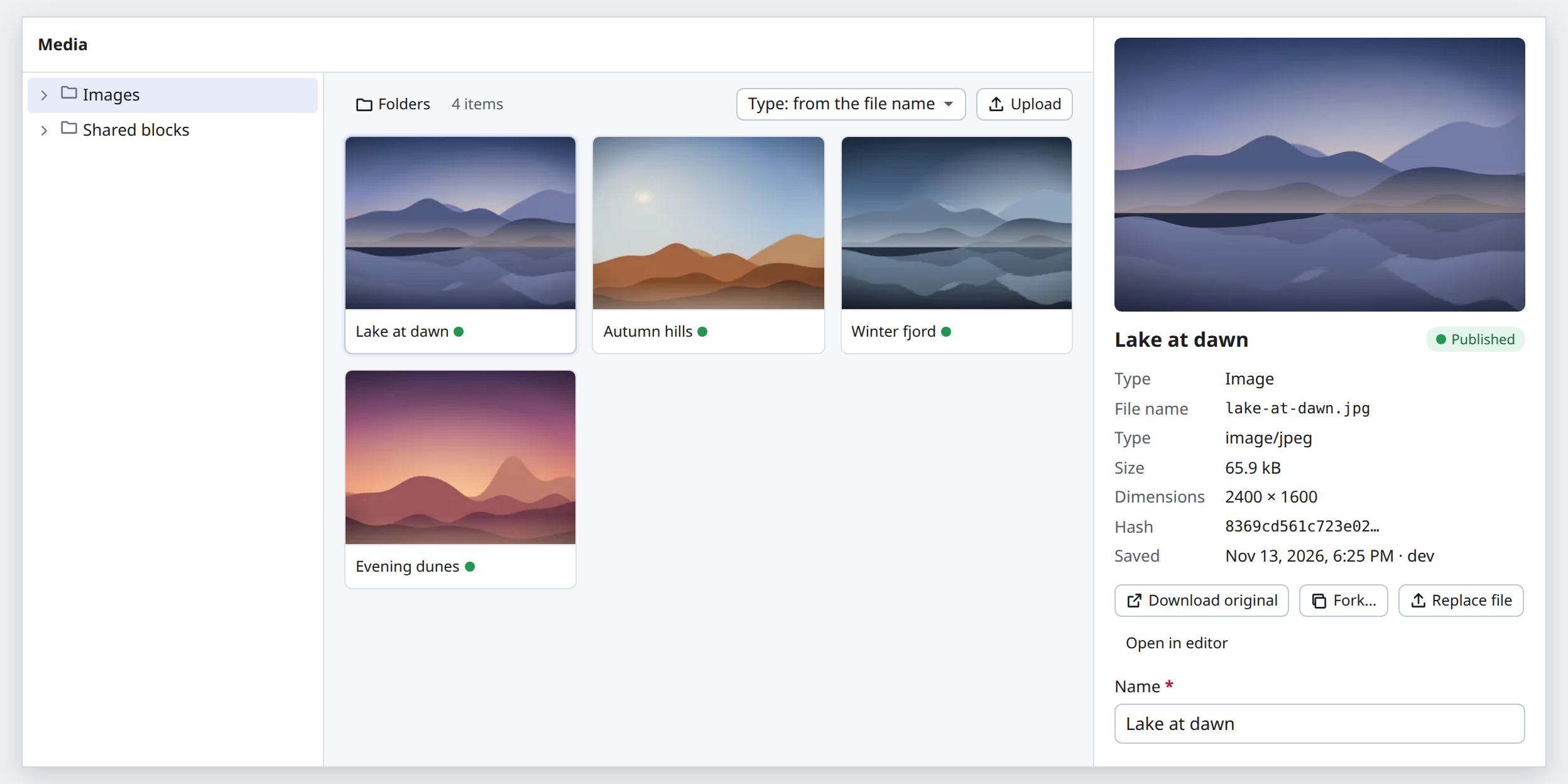
Folders, a grid of items and a details pane. Upload by picking or dropping files; the type is chosen from the file name or picked. Thumbnails of unpublished media show too.
Overlay
Section titled “Overlay”When SeeAMess runs on top of Optimizely, content shows its overlay state. The Overlay screen lists what is changed here, what changed upstream, and structure changes, with Accept upstream and Discard actions, and the sources with Adopt. See Run on top of Optimizely.


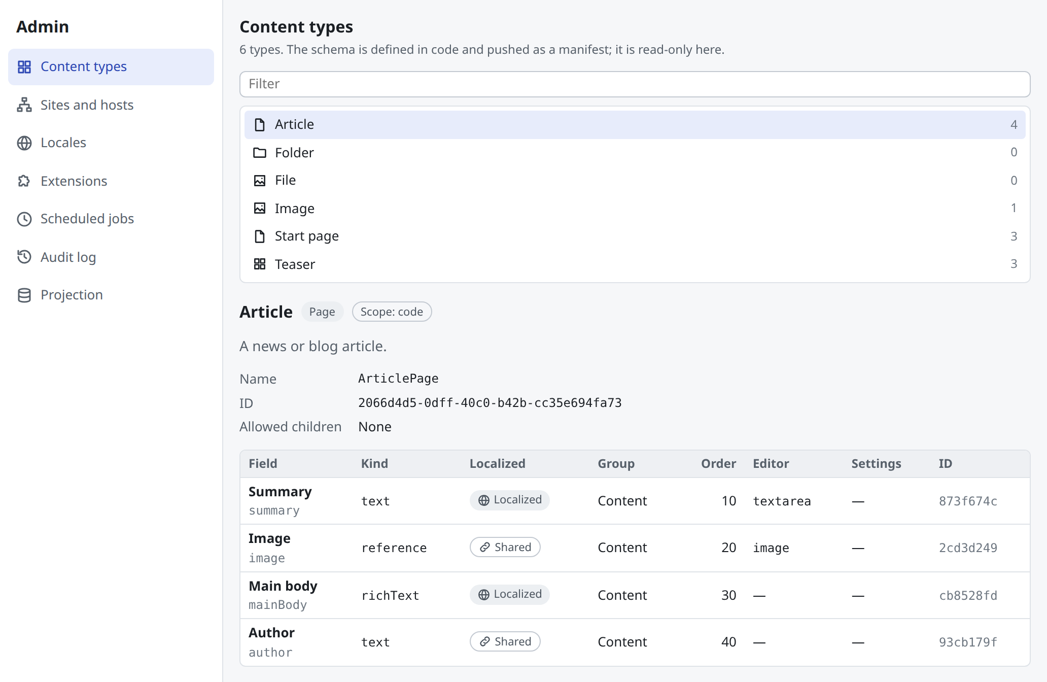
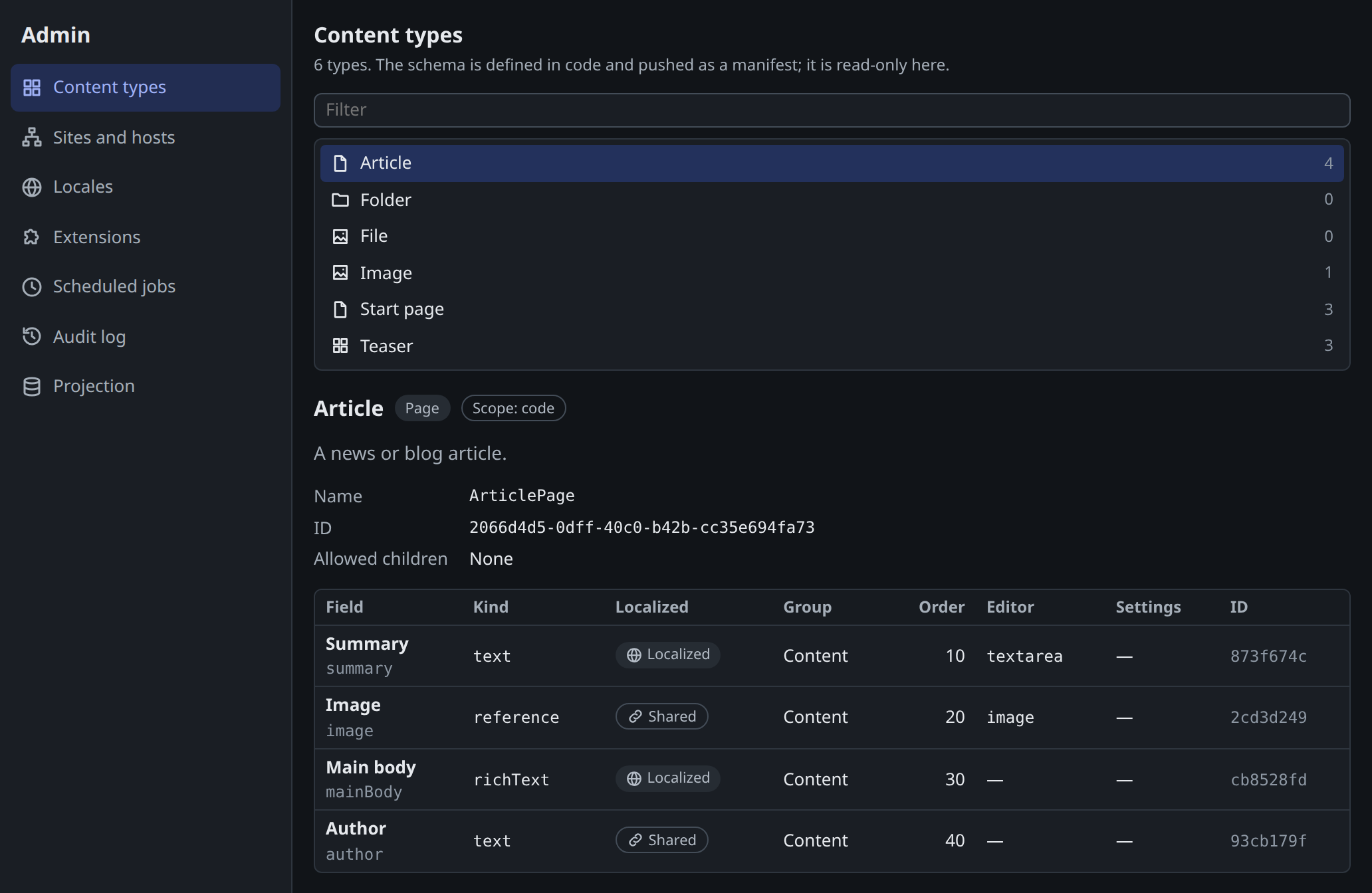
Admins see content types (a read-only view of the schema, which is defined in code), sites and hosts, locales, extensions, scheduled jobs, the audit log and projection.
Keyboard
Section titled “Keyboard”| Keys | Action |
|---|---|
Ctrl/Cmd+S |
Save draft |
Ctrl/Cmd+Shift+Enter |
Publish |
Ctrl/Cmd+K or / |
Quick search |
? |
Shortcut list |
Tree: arrows, Home, End, Enter, type-ahead |
Move, expand, collapse, open |
Tree: F2, Delete, Shift+F10 |
Rename, delete, open the menu |
Content area item: Alt+↑/↓, Delete |
Reorder, remove |
Small screens
Section titled “Small screens”Every pane beside the main one folds away. Up to 1100 px wide, panels and preview open over the form. On a phone, navigation moves to a bar at the bottom and the editor shows one pane at a time. On touch screens, controls and tree rows are 40 px high and a row menu replaces drag and drop.